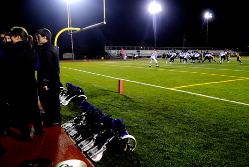
I'm with the Band: Greater STL Marching Festival, part two

I should be working on my thesis prospectus right now, but there’s nothing like a paper to make you decide to catch up on blogging.

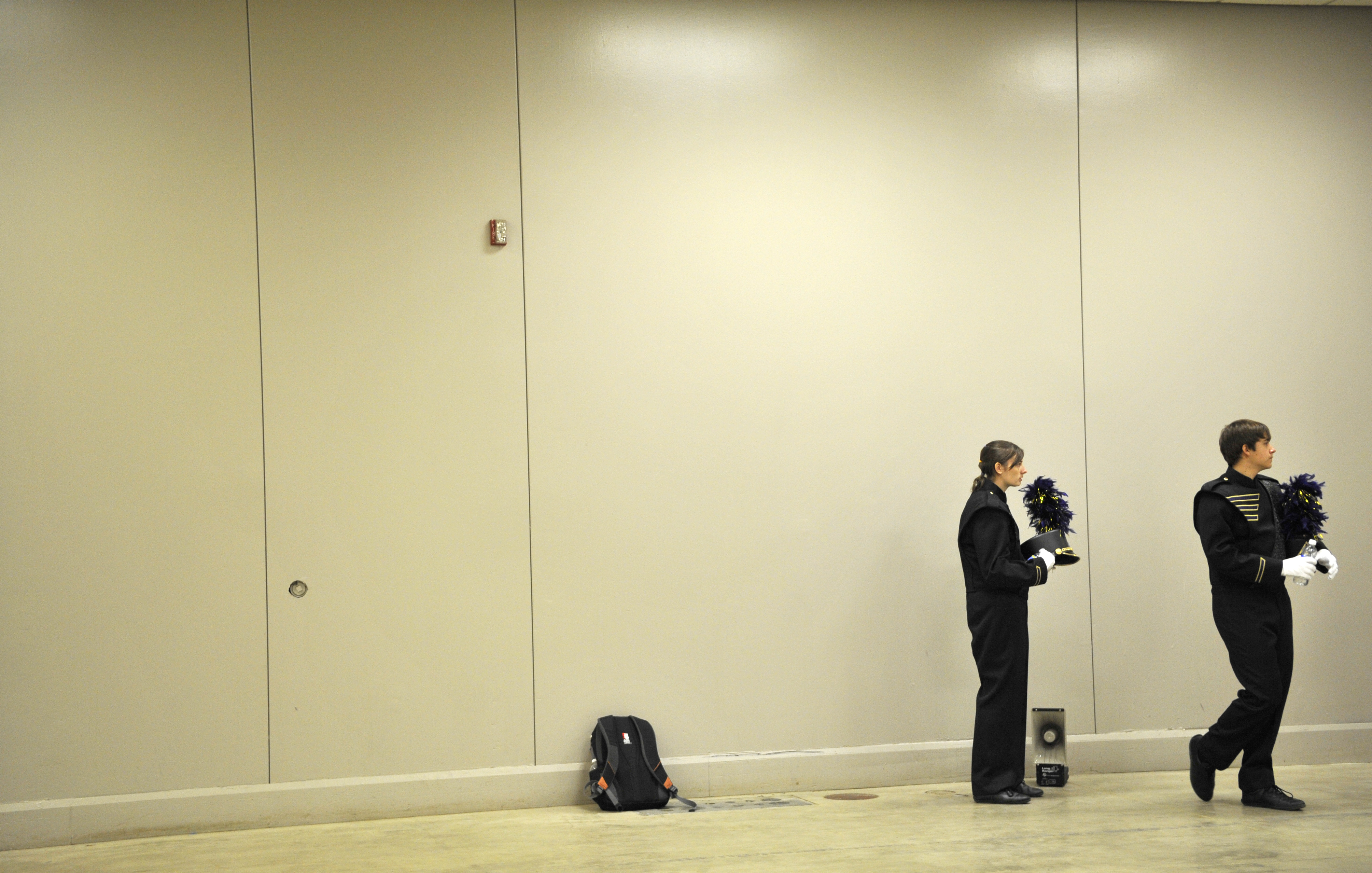
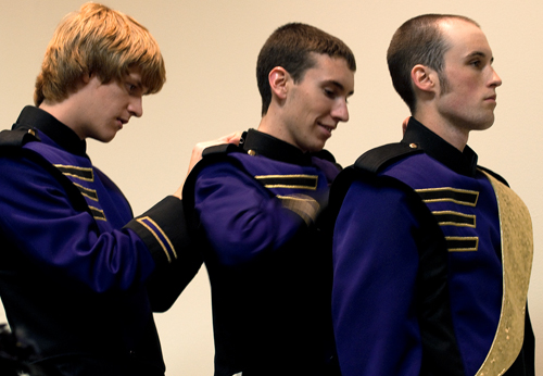
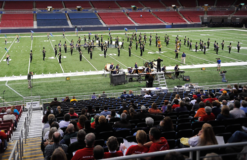
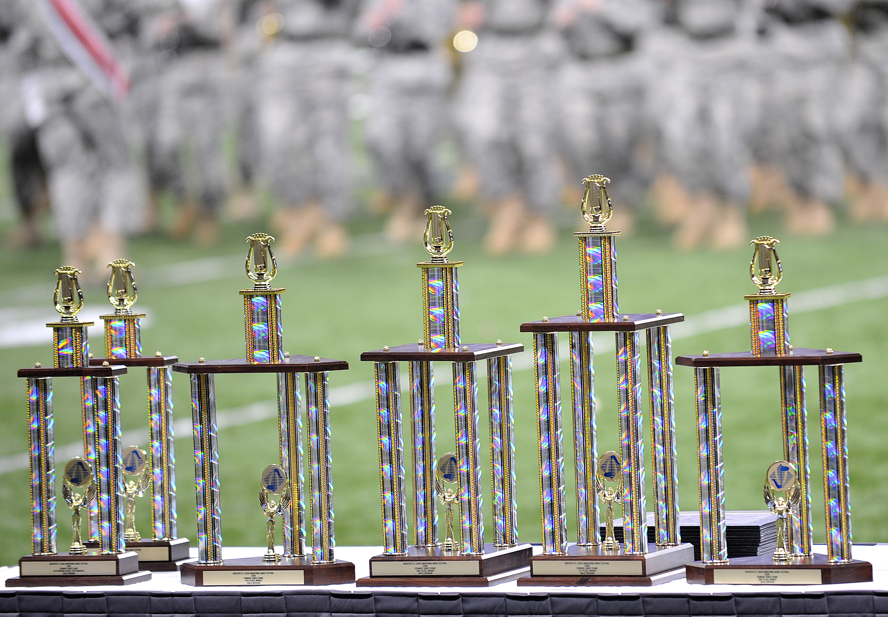
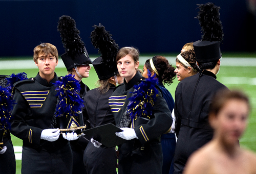
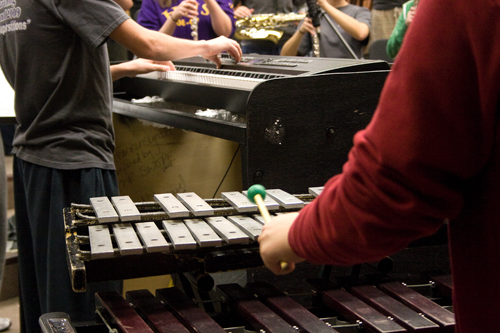
As the previous post said, I spent yesterday at the Edward Jones Dome in St. Louis following my Character Profile subjects (all 120+ of them) through the paces of performing at a band festival. Theoretically the photos I took would be incorporated into my Picture Story multimedia piece, but that’s going to need some serious re-editing in order to fit in the additional element of festival competitions. We’ll see if I have time to pull that off (again, that thesis prospectus…). In the meantime, here’s a visual summary of (almost) everything that happened yesterday.
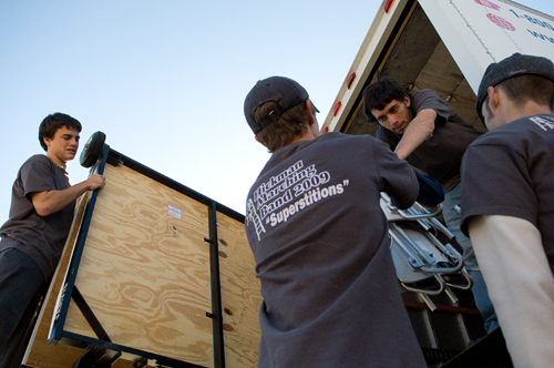
20091024_0335_web

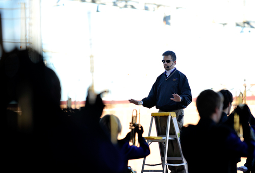
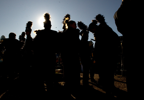
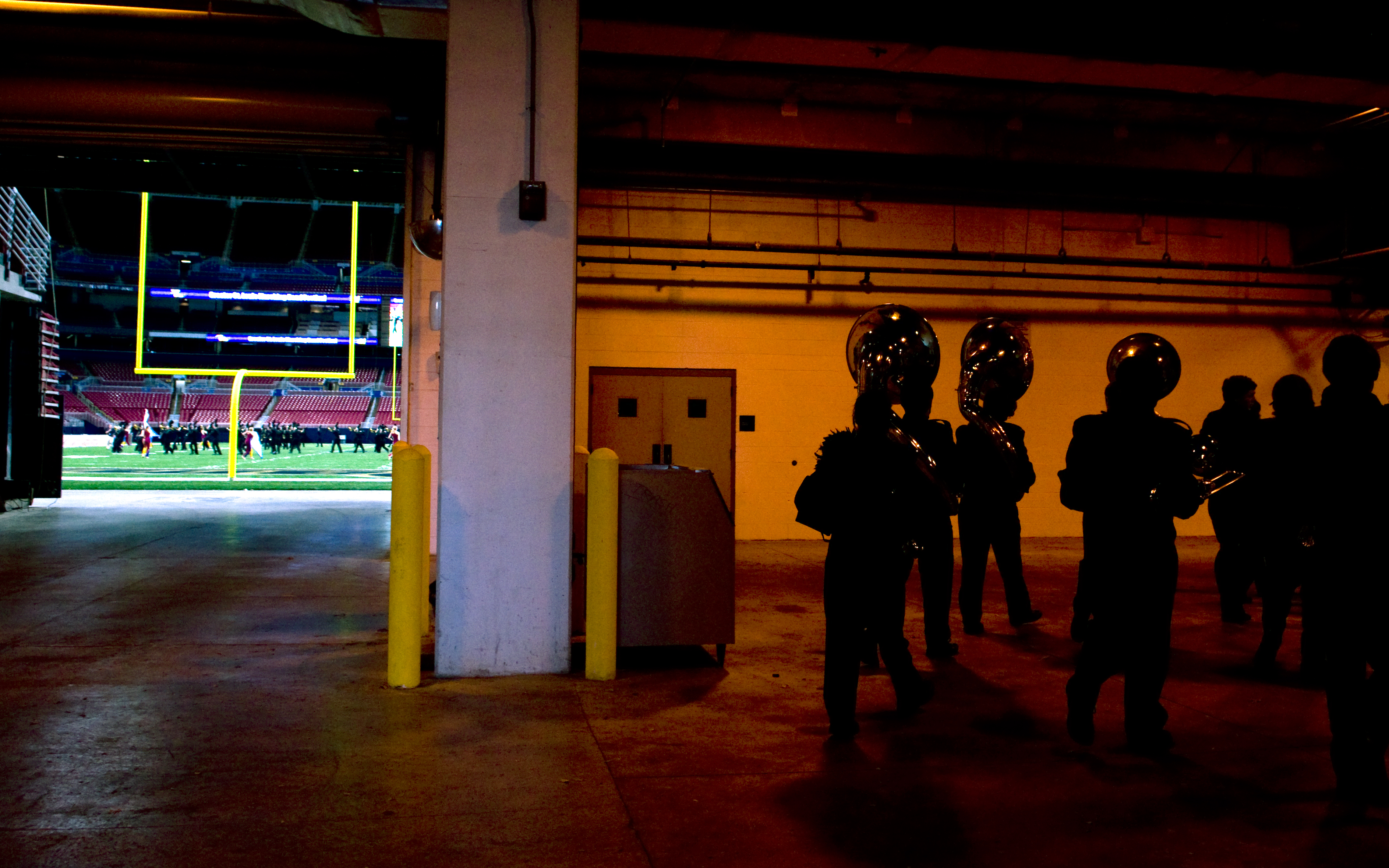
20091024_0364_webSilhouettes. I couldn’t help it.

20091024_0258_edit_webFor better or worse, I don’t usually take photos like this. Let me know if you think it worked.
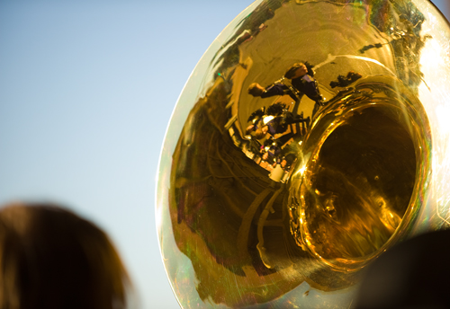
20091024_0266_web

20091024_0292_edit

20091024_0398_edit_web

20091024_0063_edit_web

20091024_0111_edit_web

20091024_0145_webHolding their certificate of recognition- but no trophy.
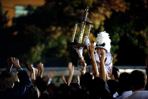
20091024_0157_webOne of the winning bands got to the parking lot at the same I did. I have to figure out which one! Argh.
Dispatch from the Greater St. Louis Marching Band Festival

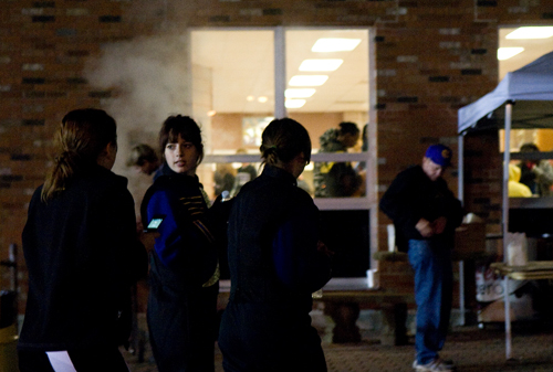
I haven’t had a chance to do more than a rough edit of my pictures from yesterday, when I went with the Hickman band to a marching festival in STL (in which the band placed a quarter-point out of trophy-level contention). Here’s one that, um, stood out a little from the others. I think there are at least three light sources competing for attention in this photo. 20091024_0396_edit_web

EPJ: Multimedia Critique 1

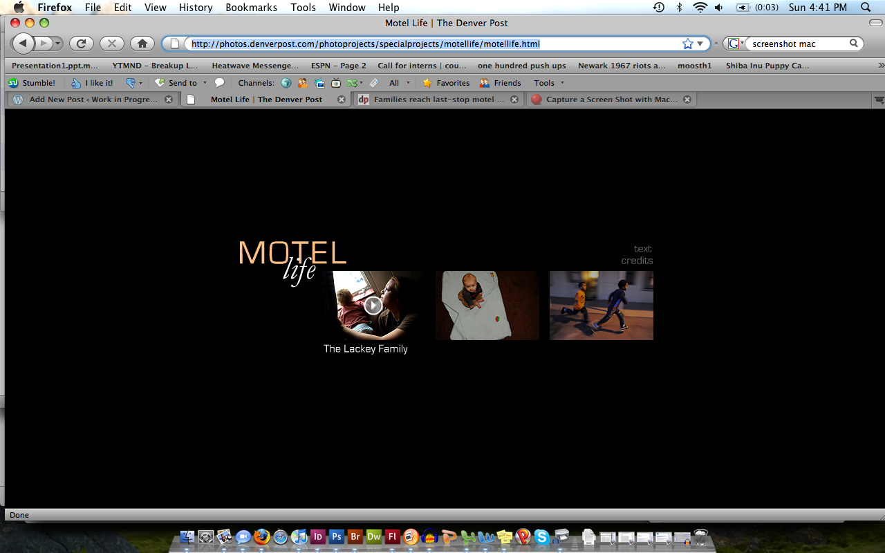
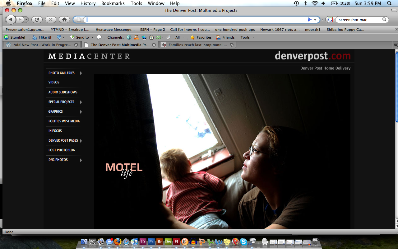
For this first multimedia critique, we were supposed to find a project on a news organization’s web site. I went to the Denver Post’s site, and found their “Motel Life” piece, which is done in Flash. I was initially impressed with the Post’s treatment of multimedia; it was a section very easy to find from the main page, and was also accessible from the ‘Photos’ section. I also liked that pieces such as “Motel Life” were listed as “Special Projects”; it made the in-depth pieces stand out from the more weekly features.

Imagen 1

Problems arose when I actually started navigating through the project. It’s clear that a significant amount of time was invested in this, and that it wasn’t just thrown together, which made it frustrating to have to sort through the problems that arose. The biggest flaw is that, although there is intra-navigation on the main html page for “Motel Life”, shown below, there’s no way to get back to the menu from the individual stories. You have to either refresh the entire webpage, or start all over again from the Multimedia page. I would have liked to have seen a menu button on each of the stories. This would essentially serve the same function as hitting refresh in the browser, but makes the show seem more integrated.

Imagen 2

I liked the simple layout of the menu and of the individual stories (I also appreciated that the accompanying text story opened in a separate window when that link was clicked),  but felt that certain features should have been incorporated. With regard to what we have discussed in class, the shows all started playing immediately once the links were clicked (a problem for the unsuspecting viewer), and no time bar was included, making me appreciate the importance of always including these in my own work.

One other aspect of this project that stood out to me was its use of music. I wish there had been more B-roll audio and less music used in these stories; I wanted to hear what the motels sounded like–did the air conditioners wheeze, did the walls creak, etc. Finally, if you listen to the third story, it uses the exact same background music as that which appears in Jenn Ackerman’s “Trapped” piece (something we’ve seen many times in the Photo sequence), which threw me off as soon as I started watching. I never really got over the strangeness. The dangers of community copyright licenses…

Picture Story: Character Profile first draft

I can’t embed Soundslides files in WordPress (gah), but here is the link to my draft of the Character Profile. The audio is pretty wretched (I was trying to make the recording levels of five different recording situations actually work together…they didn’t), but please please watch and tell me what you think! I get to rework it into a FinalCut show in the next month, so any and all feedback would be much appreciated.

The Soundslides file is here (it’ll open in a new window).

Also, a couple of images that didn’t really fit into the final audio narrative:

20091009_0314_edit_web

20091011_0404_edit_web

Mizzou vs. Nebraska: Sidelines

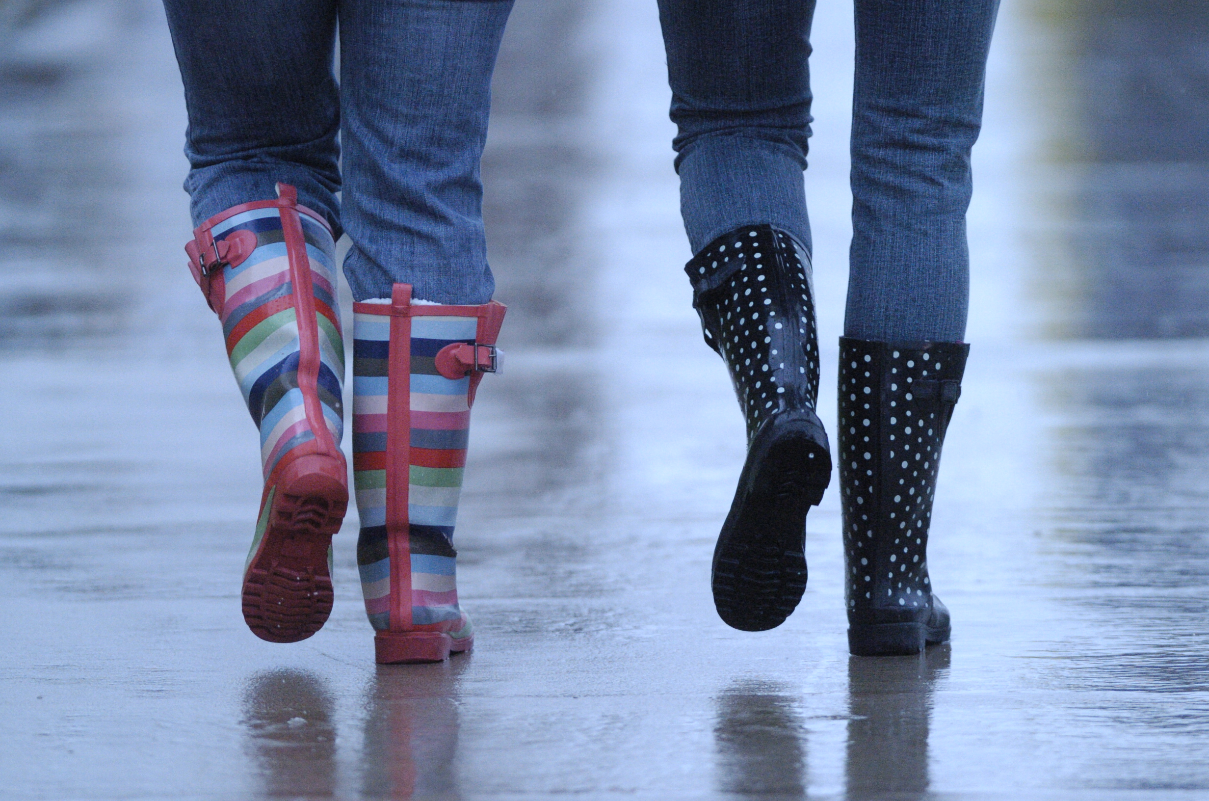
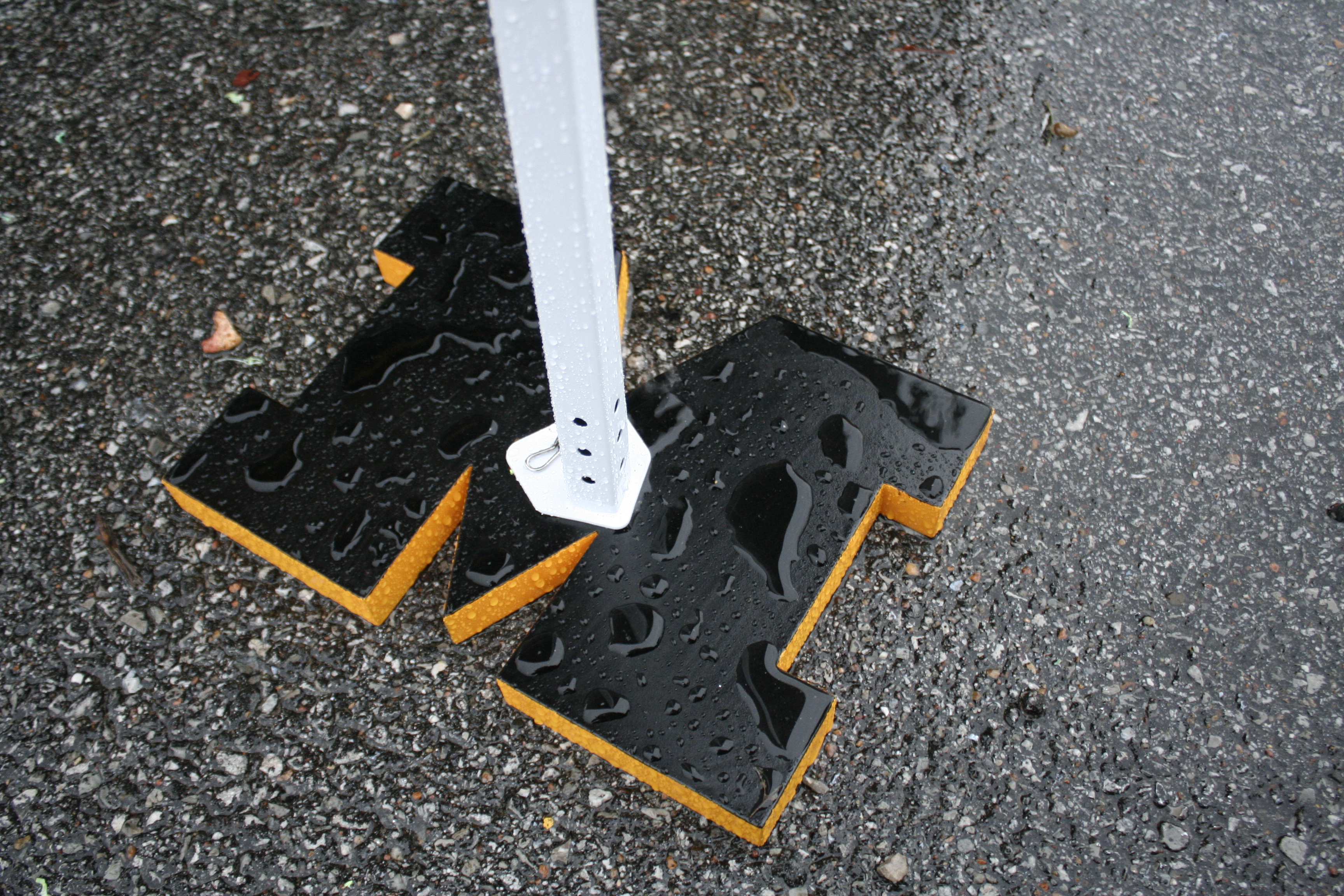
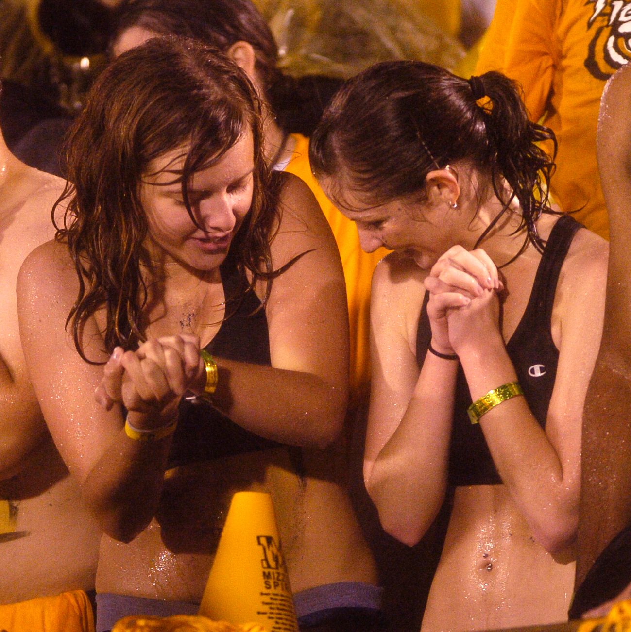
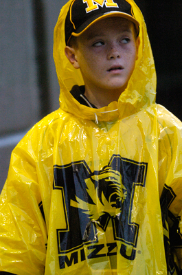
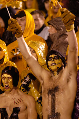
Stills from the MU-Nebraska game this past Thursday (I got to shoot pregame activities and the first half before going up to the press box to edit during the second half). I had the D2H, so most of my attention while on the field was actually focused on the people in the stands. D2H + downpour + night + action shots of football…not a combination I wanted to play with.

_DSC0010

_MG_0009

_DSC0153_web

_DSC0025_web_DSC0067_web

Strawberry shortcake, gooseberry pie: The Hickman Marching Band

These are some stills from the Character Profile I’m working on for Picture Story. My “character” is the Hickman High School marching band (I wanted to follow a drum major around, but Rita suggested just going with the whole group. Much better!), which is made up of some 120 people, including the color guard, and which currently has a better record in competition than the actual football team does.

My high school didn’t have a marching band, so most of what I already knew about band kids came from my best friend, who was a trumpet/tuba player all through high school–in Florida, where football and band are at a tier just below Friday Night Lights level. I’ve been up at Hickman five times in the past week, and can safely say that these musicians are hardcore. They’ve been simultaneously prepping for their Homecoming game (last night) and a marching festival, where they’ll be competing with other Missouri bands. Their field practices are at 6:30 in the morning, they have additional practices during actual band class and for two hours in the evening during a game week, they have to know their routines and their music cold, and on top of that, there’s the whole schoolwork thing. As one of the drum majors told me, it’s a lifestyle. I’m impressed.

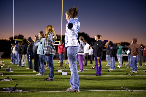
20091007_0050_edit_webWarming up during morning field practice.
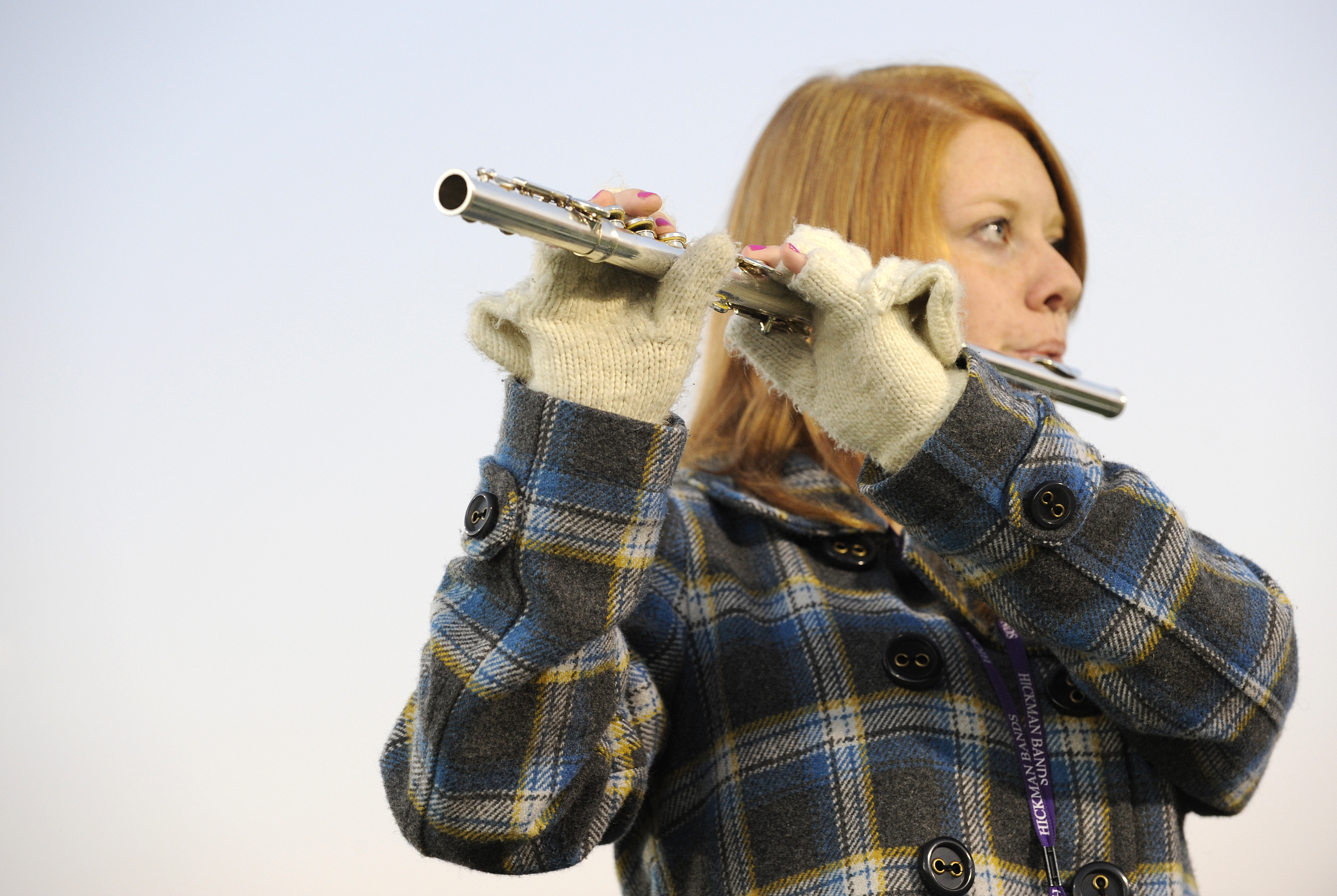
20091007_0082_editIt’s cold.

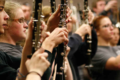
20091011_0383_webWoodwinds during indoor practice

20091009_0331_webFourth quarter of the Homecoming game (Hickman won).
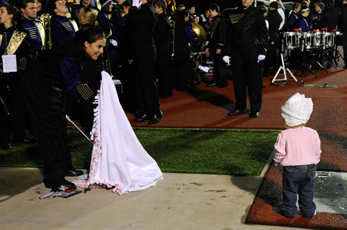
20091009_0349_webI have yet to hunt down everybody’s name…but the toddler is one of the band director’s daughters. Awww.
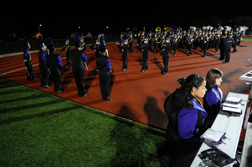
20091009_0246_webGoing out for the halftime show during Homecoming.
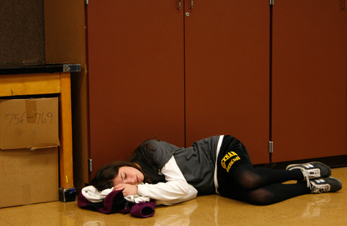
20091011_0426_webWaiting for the buses to the band festival to load. Scant rest for the weary.

EPJ: Second Website Critique

I have a feeling a lot of the MPW people are going to be critiquing the websites of the MPW faculty, but I’m going to go ahead with Penny De Los Santos’ site anyway.

I’ve seen the Livebooks format before, but I think this particular portfolio does an exceptionally good job of presenting the images and tweaking the basic template to make it more personalized. The white background, I feel, has a lot to do with this; it sets off the bright colors of Penny’s photos (and the contrast of the black and white images) in a way that black backgrounds can’t. I tend to lean toward black backgrounds when presenting my own images, so this made me rethink my ways.

I liked that there was a variety of images to choose from in each of the galleries, and particularly that there were multiple ways of selecting a large photo to view–there is both a ‘back/next’ arrow bar and a scrolling stream of thumbnails. I am not sure that I would use this particular type of scroll, as it jumps too much for my liking (I’d rather it jump to the next image one at a time instead of skipping ahead several images), but I would like to find a way to give more viewing options.

Overall, the site is well-presented; however, I wish there had been more incorporation of caption material. Only two galleries of five had this information; when it did appear, it mentioned only the publication for whom Penny was working when she made the photo. I would have liked to see more details about the subjects themselves, or where the photo was taken (this detail did appear in the ‘travel/food’ portfolio, but I feel it applies to all of the categories except the lone ‘food’ one). Also with regard to caption material, the rollover text frustrated me because I kept forgetting not to move the cursor while I was reading, and the words would disappear before I could finish. Since it is optional to show the captions in the first place, it seems like they should remain onscreen; the viewer has already seen the corresponding image in full, and the words will not distract from a proper presentation.

Imagen 4