Metal and Glass

Studio time, part deux: this time around, we were learning to work with the way light plays off metal and glass objects. I felt much more comfortable using the equipment (phew), and Daisuke was an enormous help with both setting everything up to get the right ‘look,’ and patiently moving around both the tiny mirror and the dark card to get the right shadows and highlights.

I started thinking about this assignment in very extravagant terms (I really wanted to get a saucepan, put two bananas in it, and then light them on fire using rubber cement (recreating the flambĂ© part of making bananas foster), but I think I’ll save this for later), but in the end just brought a banjo into the studio. I borrowed my mom’s banjo a couple years ago, fully intending to learn to play it, but things like Senior Year of College got in the way, so the most I can actually do is name the strings and play the opening notes from “Dueling Banjos” (of Deliverance fame) . Still, I think it’s an underrated instrument with a great sound, and, best of all for this assignment, it has a surprising amount of metal parts.

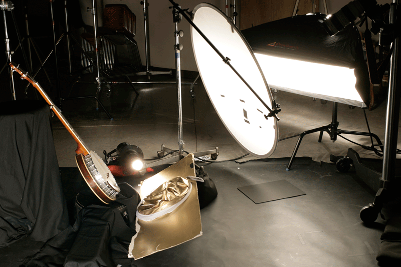
The lighting setup for this was ridiculous, and I haven’t made the diagram yet, but here is a photo (taken by Daisuke) of the basic lineup:
20090223__mg_ashei_0011

In addition to the crazy reflector setup at the bottom, Daisuke was sitting between the camera and the setup, holding a small mirror in one hand (to bring out the lower metal highlights even more), and a cut-to-size black card in the other (to darken the square metal tailpiece). It took forever to get the tailpiece to look right- we actually started out brightening it completely, but that looked strange and blown out, so we had to move on to the dark card option.

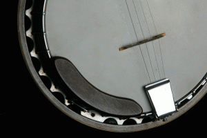
This is the first image:
20090223__mg_ashei_0013

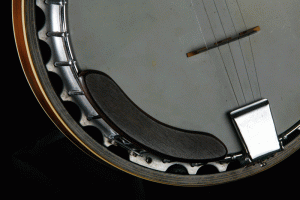
We tried a reflector to brighten the left side, but that wasn’t strong enough, so we added a whole ‘nother light, and set up the gold reflector underneath instead:
20090223__mg_ashei_00221

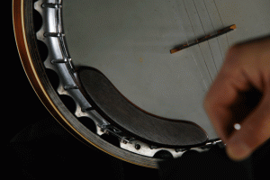
Which was all well and good (the wooden rim is so pretty!!), but the tailpiece looked out of place. We tried using a dark card, but it was too big, and darkened the entire instrument:
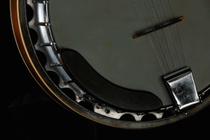
20090223__mg_ashei_005120090223__mg_ashei_0054

The final select was shot at f/9.0, ISO 100, shutter speed 1/125.
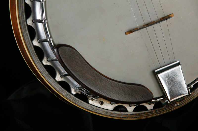
20090223__mg_ashei_0110

I wish it weren’t so reflective on the wooden rim (well, the left side, at least), and I think we could have cut an arc out of a dark card and made a gobo to fix this, but otherwise, I very much like how it turned out.

Fun fact: Steve Martin plays the banjo.

Some good banjo songs (outside of the bluegrass realm): “Take It Easy” (Eagles), “I’m Shipping Up To Boston” (Dropkick Murphys- it’s part of the soundtrack of The Departed), and “Unwell” (matchbox20- I don’t remember anything that came off their last album- except this song. Because it has a banjo). Also, there’s apparently a cover version of “Baba O’Reilly” that uses a banjo, and I really need to find this. Let me know if you do!
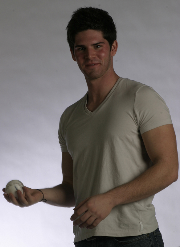
Final Select: Classmate Portrait

Well, despite the advice of others, I couldn’t bring myself to use the tungsten-setting photo…the skin tones were (surprise!) kind of blue, and that was more than a little odd. So I ended up cropping one of the black spot ones, and turned that in as a select. I’m not completely satisfied with the way it turned out; I could have done a20090217_cmp_ashei__0089_lr wayyyy better job of lighting Matt’s hair, and his face is a liiiiiittle too shadowed…I also think stopping up one or two would have made a huge difference, as I shot this at 1/45 of a second (sheesh…).
But anyway, I suppose you have to start somewhere when working in the studio, and I’m much less overwhelmed by all of the technical stuff that I was a week ago. We’ll see how it all turns out with Metal and Glass next assignment.

Photo/Society notes

For Thursday’s class, we read the first part of this book entitled THE POWER OF PHOTOGRAPHY: How Photographs Changed Our Lives–which to me seemed an overly dramatic, slightly hyperbolic title. And then I actually read the assignment, and thought to myself, well, damn, the title was appropriate after all. In the grand scheme of things, it seems that photography has lost a tiny bit of its power in the face of image oversaturation, but historically, it’s catalyzed some fairly [understatement] important events and will no doubt continue to do so. Someone in class pointed out that despite video being the apparently more advanced technology, people tend to remember events in still images–the scene of the Vietnam execution photo was also videotaped, but nobody remembers that footage. They remember the photograph. It’ll be interesting to see if YouTube and its video clip database changes this.

Because I am a layout nerd, I was also very impressed with the design of the book; it wins top points for effectiveness in conveying a message. Most books are set up so that the text and its related visuals are all on the same page. Your eye goes straight to the photo, reads the caption, and only then moves on to read the text. There was some of this typical setup in the book, but not where the author wanted to drive home a point; namely, the story about the photographs of Civil War POWs in prison. I didn’t have any background at all on this story (which is ironic, because I actually took a Civil-War-only class in high school…but we never talked about prisoner treatment), and had never even considered the state of POWs. Anyway, the piece detailed an image propaganda campaign fueled against the Southern prisons (no matter that the conditions of Union prisons were no better) by the POW photographs of starving, wasting-away, skeleton Union soldiers that came out after the war was over. The only person executed for war crimes after the Civil War was the warden of Andersonville (GA) prison, Henry Wirz–who was condemened almost entirely on the basis of the images.

So you’re reading along, kind of distracted by this new information, and having to imagine for yourself what these pictures must have looked like–because these pages are all text–and you think you have a pretty good image in your head. Okay, you think, let’s read some more about the power of photography. And you turn the page, where you are confronted with a reproduction of this photo, which is appalling and horrifying, it’s like nothing you could have ever possibly imagined, and then you have to spend a wrenching moment convincing yourself that yes, that person is really alive. But although that photo would be a gutcheck regardless of its context, the fact that a mental image was already there, created by the text of previous pages and  then completely blown out of the water by the real photograph…it somehow forces the message in a way that would be impossible if the image and text were on the same page. It’s a very subtle, yet very effective, decision on the part of the book designers.

Another interesting fact from class: The Earthrise photo taken by the Apollo 8 expedition (it took me a second to realize that we’re only had space images of Earth, in its ‘natural habitat,’ if you will, for 47 years. Forty-seven years! That’s peanuts) is always presented in landscape format, with a horizon. But in the house of the astronaut who took the photo, it hangs vertically, in portrait format. It makes perfect sense, since the guy was in orbit at the time, but who would ever think of such a detail? Every book I’ve ever seen that picture in places it horizontally, to mimic the sunrise and fully create that metaphor. When I am settled enough to start filling my house with giant photo reproductions, I’m hanging my copy of the Earthrise the way it was originally seen.

Copy Stand/Tungsten Test

20090202_xx_ashei_0010For this week’s assignment, we had to find two images from a magazine (one in which the lighting contributed to the overall mood of the photo, and one in which we wanted to know how exactly the lighting was done) and photograph them using the copy stand. We also had to ‘finish the roll’ (in film terms) of images–the catch being we had to keep the white balance set to Tungsten.

I tried shooting under several light situations (getting all the more annoyed because the Tungsten setting, well, works best when you have a tungsten light source…) before heading into the Heidelberg for some indoor photos. And–yay!–the lighting was good old-fashioned tungsten; no crazy flourescence for this bar. Long story short–this is my favorite image from the entire session. I’m partial to images of bars anyway, since my dad and brother were both bartenders, and I like the clarity (not quite present in the web image) and detail in the photo.

Bartender Jeramiah Soles straightens the counter area behind the bar of The Heidelberg restaurant in Columbia, MO. Soles has been working at The Heidelberg for ten years, though he became a mixologist only after five years as a cook. The job itself is “a little stressful,” he says.

The copy stand was a little more tricky than I’d thought it would be, probably because I am short and was standing on my tiptoes, straining leg muscles I didn’t know existed, while trying to make my copy of the full-page-spread seal photo. There’s a little bit of glare on the left side of the gutter (this story was towards the back of the magazine, making it difficult to flatten the entire page evenly…but there was probably a way to do this that I didn’t think of at the time. Grr), but color-wise, it came out great (I LOVE the bright red of the right seal’s yawn). I couldn’t figure out if any artificial lighting was used, so this is my ‘stump the chump’ select.

20090129_ct_ashei_selects_0042

Photo (c) Yva Momatiuk and John Eastcott; National Geographic, 11/2008

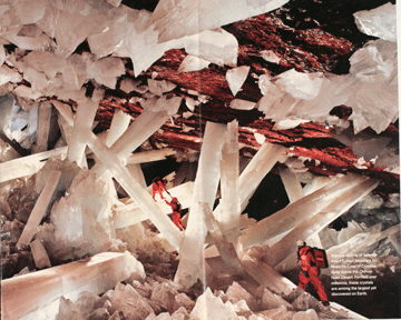
My second copy stand image is from the same issue of National Geographic; specifically, from a story on a cave of giant crystals in Mexico. Particularly when compared to the images from INSIDE the cave (I’m including a copy stand shot of that, too, but I picked the darker photo for officially turning in because it seems more evocative), I think this photo does a great job of conveying the sense of traveling into a semi-alien world. There are a few dust specks from the glass that I didn’t notice when I was making the copies, but hopefully they don’t take too much away from the image itself. Anyway, here are both images- look at the size of the crystals! Crazy stuff.

20090129_ct_ashei_selects Photos (c) Carsten Peter; National Geographic, 11/2008
20090129_xx_ashei_0045