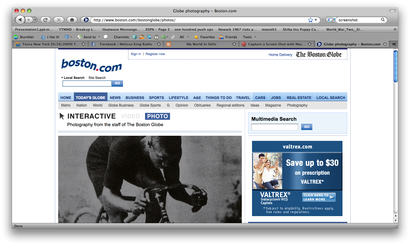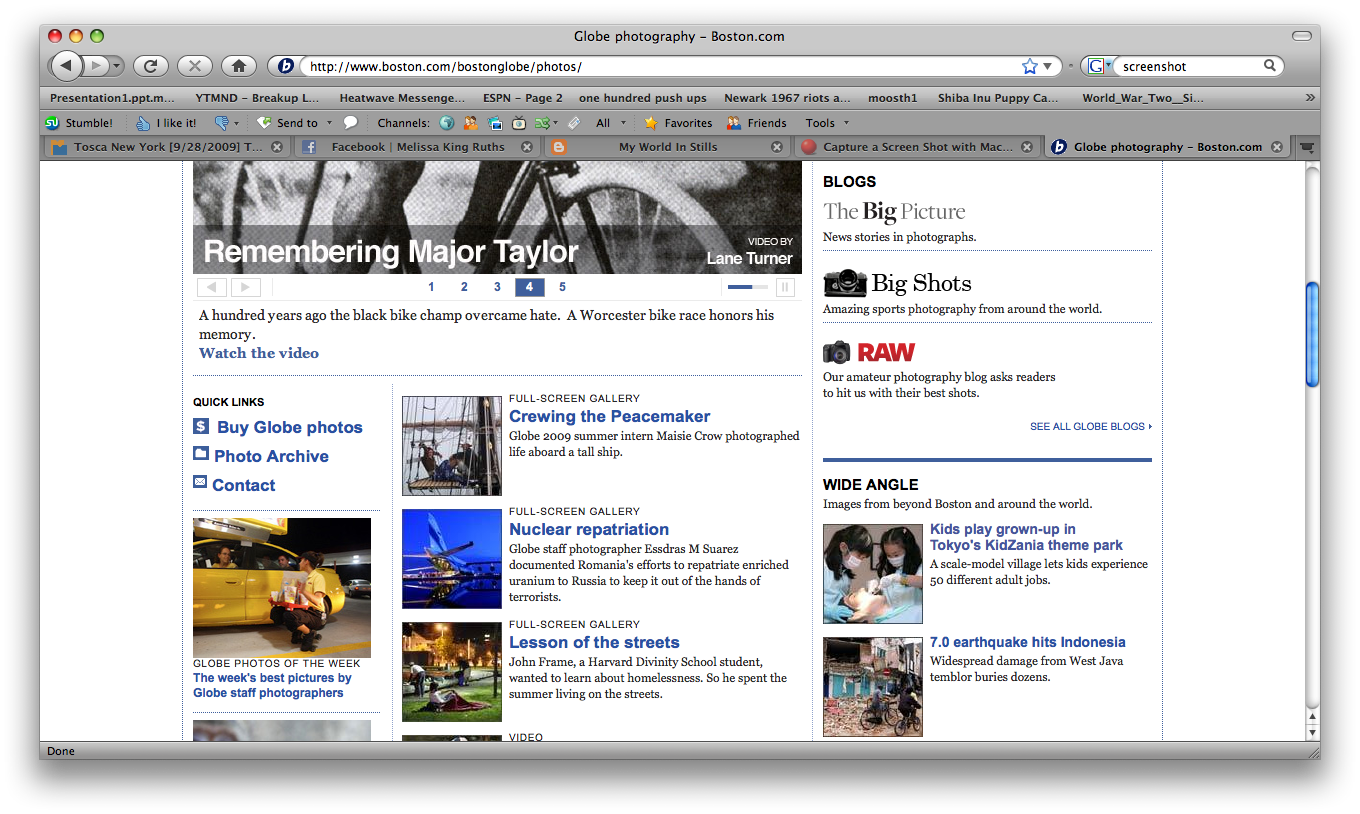
http://www.boston.com/bostonglobe/photos/
On the websites of many newspapers, photographs are treated as supplementary visual information to the meat of the article they accompany. While photography is allowed more of a stay in the spotlight due to the increased space allowed by online publications, there appears to be a tendency to underutilize the platform when it comes to running images.
The Boston Globe, however, is one of those outlets that does recognize and work with the potential offered by the web. The site is by no means perfect—when images run with news stories, the old patterns often still apply—but the “Photography” section of bostonglobe.com offers something entirely different. Special efforts are made to showcase the efforts of the Globe’s staff photographers, but other photo collections, composed of wire images, make up a considerable portion of the page. The site itself could be a little more streamlined—there are so many choices for photo viewing on one page that it’s a little overwhelming—but at the same time, the variety of collections available on one page for browsing minimizes the time viewers spend clicking around to find a slideshow.

The best part of the site, however, is the size at which the images in the collections are run. The default minimum width for the photos is 959 pixels, and viewers can also choose to employ the “full screen” option.
Links to the main Globe photo blogs are prominent and easy to find, but it was somewhat frustrating to visit the “Big Shot” sports photoblog only to discover that its host page was the Sports section, and that I had to click the back button in order to get back to the Photo area. This was not an issue with the other blogs, however.
Overall, the Boston Globe’s photo section does an excellent job of showcasing its visual information. While there are some navigation tweaks to be worked out, the site itself stands out as a good model of how online news outlets can work with the web.