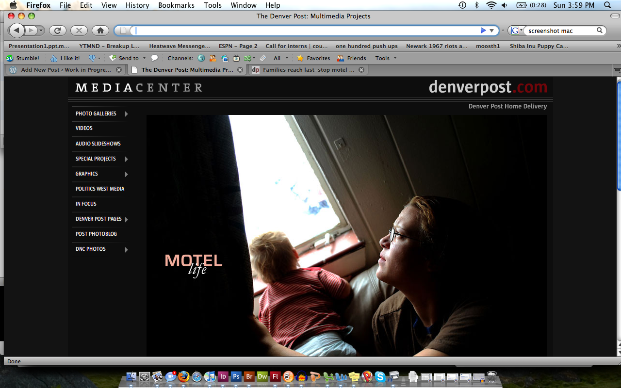
For this first multimedia critique, we were supposed to find a project on a news organization’s web site. I went to the Denver Post’s site, and found their “Motel Life” piece, which is done in Flash. I was initially impressed with the Post’s treatment of multimedia; it was a section very easy to find from the main page, and was also accessible from the ‘Photos’ section. I also liked that pieces such as “Motel Life” were listed as “Special Projects”; it made the in-depth pieces stand out from the more weekly features.

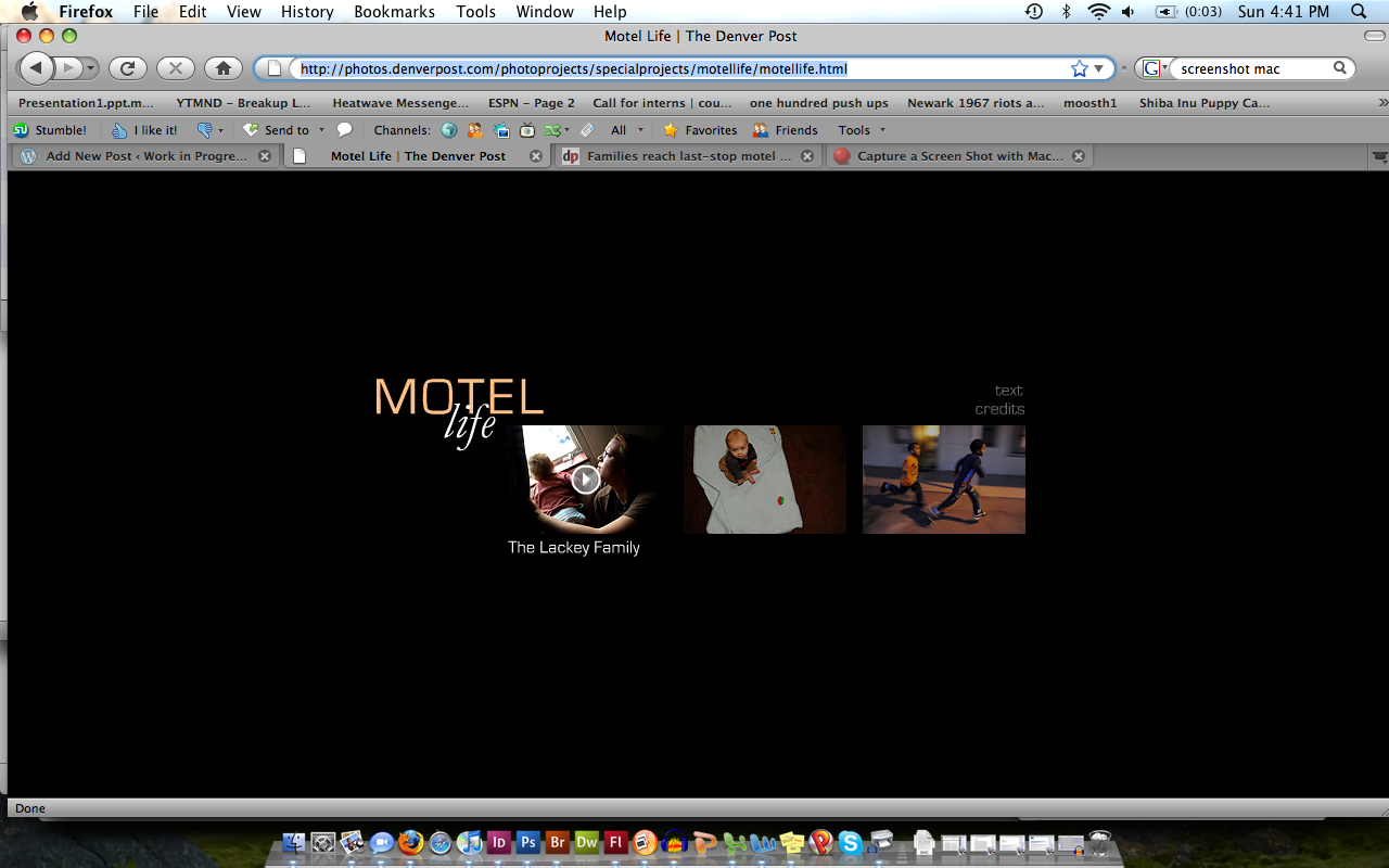
Problems arose when I actually started navigating through the project. It’s clear that a significant amount of time was invested in this, and that it wasn’t just thrown together, which made it frustrating to have to sort through the problems that arose. The biggest flaw is that, although there is intra-navigation on the main html page for “Motel Life”, shown below, there’s no way to get back to the menu from the individual stories. You have to either refresh the entire webpage, or start all over again from the Multimedia page. I would have liked to have seen a menu button on each of the stories. This would essentially serve the same function as hitting refresh in the browser, but makes the show seem more integrated.

I liked the simple layout of the menu and of the individual stories (I also appreciated that the accompanying text story opened in a separate window when that link was clicked), but felt that certain features should have been incorporated. With regard to what we have discussed in class, the shows all started playing immediately once the links were clicked (a problem for the unsuspecting viewer), and no time bar was included, making me appreciate the importance of always including these in my own work.
One other aspect of this project that stood out to me was its use of music. I wish there had been more B-roll audio and less music used in these stories; I wanted to hear what the motels sounded like–did the air conditioners wheeze, did the walls creak, etc. Finally, if you listen to the third story, it uses the exact same background music as that which appears in Jenn Ackerman’s “Trapped” piece (something we’ve seen many times in the Photo sequence), which threw me off as soon as I started watching. I never really got over the strangeness. The dangers of community copyright licenses…

