icons

Maybellene, why can't you be true?

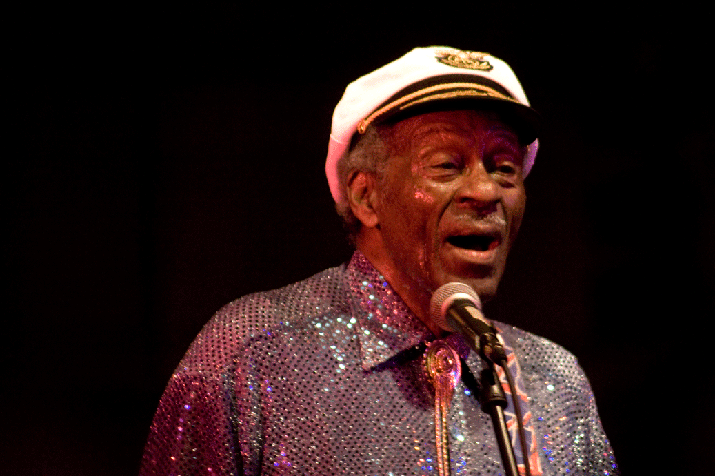
We interrupt this slate of summer-happenings posts for yet another concert post. I actually don’t go to many concerts; I don’t think I’ve been to more than ten in my life. But tonight Chuck Berry, aka the King of Rock and Roll, the guy whose sound basically created the sound of the early Beatles, (especially) the early and middling Stones, and the Beach Boys (“Sweet Little Sixteen”/”Surfin’ USA”), among others, played a free concert in Columbia as part of the Summerfest series sponsored by the Blue Note.

I had heard that previous Summerfest concerts didn’t allow large cameras in to the blocked-off street area, so I left my Canon at home before heading down to Ninth St. I then realized this was a very stupid move, as there was in fact no restriction at all on cameras, and I should have been practicing the ‘better to ask forgiveness than permission’ principle of photo-j. Fortunately, I got to the venue three hours before Mr. Berry came on stage (thinking he would play one, not three hours after the gates opened), so I had plenty of time to zip back home and get my gear. This, by contrast, was a very good move. I would have been so frustrated to not have any of my own images of the show. But now I do!

And, wow, what a show. I mean, Chuck Berry is going to be 83 years old in October, and here he was playing guitar for a 45-minute outdoor set, singing his heart out, and duck walking during “Johnny B. Goode.” If I’m in half that shape when I’m 83, I’ll consider myself pretty lucky. He wasn’t perfect–some chords were off, he sang in odd keys for some songs, blah blah etc etc–but there’s something refreshing about the lack of polish. Rock isn’t supposed to be polished. I saw the Stones play a few years ago in Houston, and while it was great to see them live, the concert was part of an arena tour, more of a piece of choreography than anything else.

On a similar note, the show tonight was, as mentioned, free. There’s something wonderful, I think, about watching a performer sing and play purely for love of the game. The something wonderful becomes all the more “whoa”-inspiring when you stop to consider that the love of the game has been such a time-spanning affair. The affair looks like it’s going to continue for even longer–Berry’s son Charles Jr. plays guitar in the backup band. Aww.

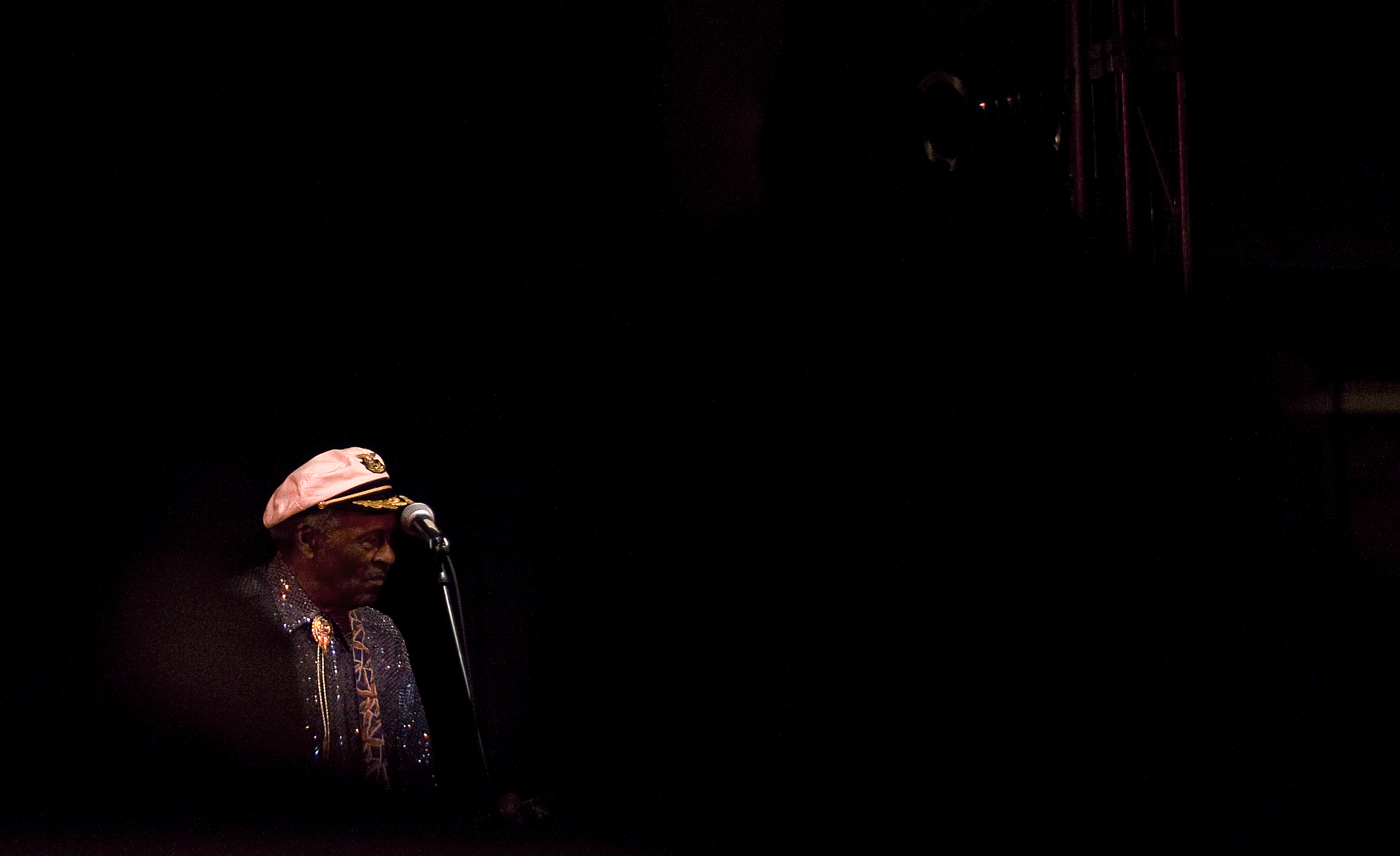
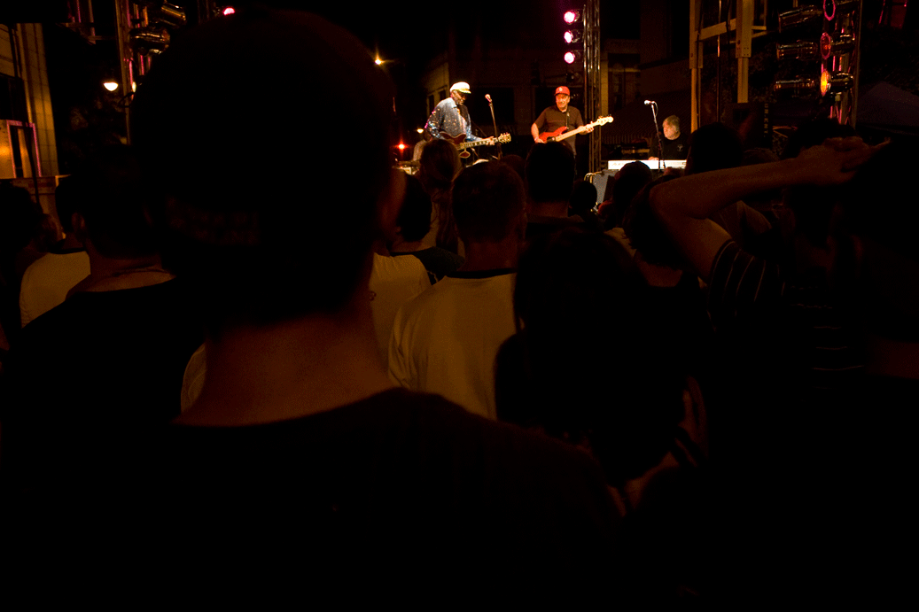
The problem with bringing a camera to a concert, however, is that I’m just too darn short, and I have to Hail Mary all the time while trying to get decent images. It’s hard to Hail Mary with a telephoto lens, though, so I had to wait until the bodies in front of me kindofsortof moved out of the way–for a hair of a second–so I could get a frame in. BUT…all of the masses in front also provided instant negative space to work with, which ended up working better than I thought it would. Exhibit A:
20090826_0004_edit

There are a few more that follow- again, here I am stuck in one spot at the concert and unable to really vary the images (I think this point is much more clear if you look at the previous concert post and compare it to this one). Or is this just a by-product of concert photography? Either way, it’d probably be good to bring my flash next time I’m at a show (whenever that will be) and try to play around with that, for something new and exciting.
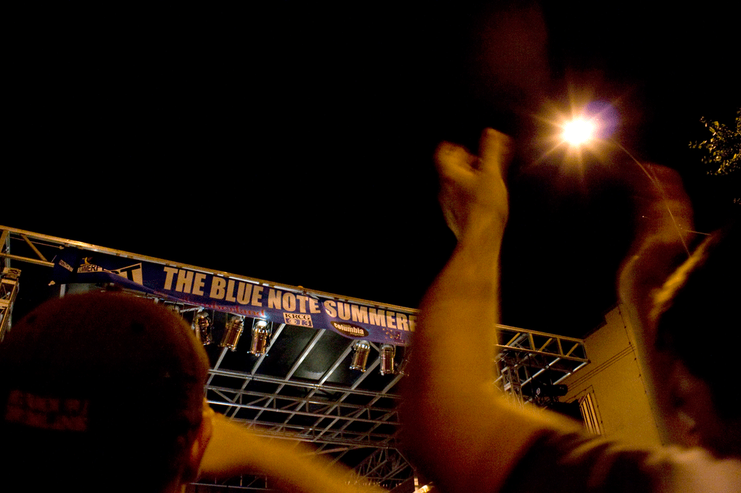
20090826_0027_edit

20090826_0030_edit

20090826_0021_edit

Photo in Society: Icons! (and a video)

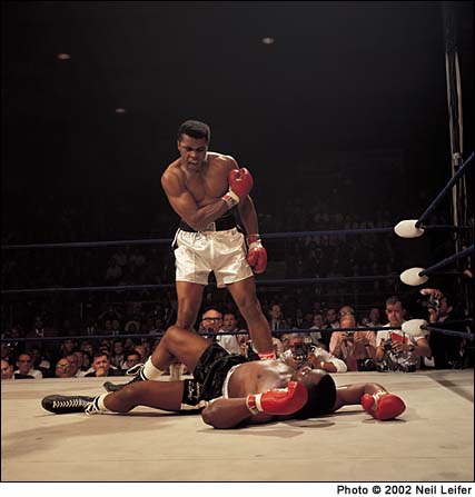
Okay, so I picked that picture as my paper topic- or rather, that’s one of the incarnations of the photo. The other is nearly identical (except for being in color), was taken by Neil Leifer of Sports Illustrated, and gets way more attention than poor John Rooney’s ever did, despite the fact that Rooney’s was the one that all the newspapers ran in the first place (in fact, according to the Internet, John Rooney might as well not exist. I spent all weekend trying to find something, anything, about the man besides the fact that he was an AP photographer. It’s the only time Google has ever failed me).

John Rooney/AP

Anyway, the Leifer image was used in 2004 as part of the Adidas “Impossible is Nothing” campaign (interestingly, they converted it to black and white, so it look even MORE like Rooney’s photo), which a) helps boost the whole ‘icon’ argument (woo!) and b) lets me segue into a shameless plug for one of the greatest commercials ever.

[youtube=http://www.youtube.com/watch?v=LFabpG4Y-Uo]

Which is the entire point of this post, really. I just wanted an excuse to link to the video, because I love it so much.

Photo in Society: paper topic

Help me decide on a paper topic for Photo in Society!

Or, more to the point, help me figure out if the photo I want to write about is ‘iconic’ enough.

[John Rooney/AP/1965]

It didn’t raise mass awareness of an issue, or anything comparable, but I have a hard time coming up with any sports photos that are as ingrained in the public consciousness (the Black Power fist salute is the only other one that comes to mind). I suspect people remember sports moments more in terms of video than anything else.

What do you think? Is this picture sufficiently iconic? Am I just blanking on other well-known sports images?

Photo/Society notes

For Thursday’s class, we read the first part of this book entitled THE POWER OF PHOTOGRAPHY: How Photographs Changed Our Lives–which to me seemed an overly dramatic, slightly hyperbolic title. And then I actually read the assignment, and thought to myself, well, damn, the title was appropriate after all. In the grand scheme of things, it seems that photography has lost a tiny bit of its power in the face of image oversaturation, but historically, it’s catalyzed some fairly [understatement] important events and will no doubt continue to do so. Someone in class pointed out that despite video being the apparently more advanced technology, people tend to remember events in still images–the scene of the Vietnam execution photo was also videotaped, but nobody remembers that footage. They remember the photograph. It’ll be interesting to see if YouTube and its video clip database changes this.

Because I am a layout nerd, I was also very impressed with the design of the book; it wins top points for effectiveness in conveying a message. Most books are set up so that the text and its related visuals are all on the same page. Your eye goes straight to the photo, reads the caption, and only then moves on to read the text. There was some of this typical setup in the book, but not where the author wanted to drive home a point; namely, the story about the photographs of Civil War POWs in prison. I didn’t have any background at all on this story (which is ironic, because I actually took a Civil-War-only class in high school…but we never talked about prisoner treatment), and had never even considered the state of POWs. Anyway, the piece detailed an image propaganda campaign fueled against the Southern prisons (no matter that the conditions of Union prisons were no better) by the POW photographs of starving, wasting-away, skeleton Union soldiers that came out after the war was over. The only person executed for war crimes after the Civil War was the warden of Andersonville (GA) prison, Henry Wirz–who was condemened almost entirely on the basis of the images.

So you’re reading along, kind of distracted by this new information, and having to imagine for yourself what these pictures must have looked like–because these pages are all text–and you think you have a pretty good image in your head. Okay, you think, let’s read some more about the power of photography. And you turn the page, where you are confronted with a reproduction of this photo, which is appalling and horrifying, it’s like nothing you could have ever possibly imagined, and then you have to spend a wrenching moment convincing yourself that yes, that person is really alive. But although that photo would be a gutcheck regardless of its context, the fact that a mental image was already there, created by the text of previous pages and  then completely blown out of the water by the real photograph…it somehow forces the message in a way that would be impossible if the image and text were on the same page. It’s a very subtle, yet very effective, decision on the part of the book designers.

Another interesting fact from class: The Earthrise photo taken by the Apollo 8 expedition (it took me a second to realize that we’re only had space images of Earth, in its ‘natural habitat,’ if you will, for 47 years. Forty-seven years! That’s peanuts) is always presented in landscape format, with a horizon. But in the house of the astronaut who took the photo, it hangs vertically, in portrait format. It makes perfect sense, since the guy was in orbit at the time, but who would ever think of such a detail? Every book I’ve ever seen that picture in places it horizontally, to mimic the sunrise and fully create that metaphor. When I am settled enough to start filling my house with giant photo reproductions, I’m hanging my copy of the Earthrise the way it was originally seen.