Photo in Society

Photo in Society: Icons! (and a video)

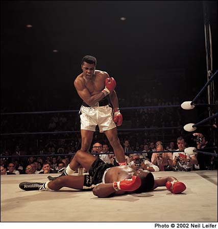
Okay, so I picked that picture as my paper topic- or rather, that’s one of the incarnations of the photo. The other is nearly identical (except for being in color), was taken by Neil Leifer of Sports Illustrated, and gets way more attention than poor John Rooney’s ever did, despite the fact that Rooney’s was the one that all the newspapers ran in the first place (in fact, according to the Internet, John Rooney might as well not exist. I spent all weekend trying to find something, anything, about the man besides the fact that he was an AP photographer. It’s the only time Google has ever failed me).

John Rooney/AP

Anyway, the Leifer image was used in 2004 as part of the Adidas “Impossible is Nothing” campaign (interestingly, they converted it to black and white, so it look even MORE like Rooney’s photo), which a) helps boost the whole ‘icon’ argument (woo!) and b) lets me segue into a shameless plug for one of the greatest commercials ever.

[youtube=http://www.youtube.com/watch?v=LFabpG4Y-Uo]

Which is the entire point of this post, really. I just wanted an excuse to link to the video, because I love it so much.

Photo in Society: paper topic

Help me decide on a paper topic for Photo in Society!

Or, more to the point, help me figure out if the photo I want to write about is ‘iconic’ enough.

[John Rooney/AP/1965]

It didn’t raise mass awareness of an issue, or anything comparable, but I have a hard time coming up with any sports photos that are as ingrained in the public consciousness (the Black Power fist salute is the only other one that comes to mind). I suspect people remember sports moments more in terms of video than anything else.

What do you think? Is this picture sufficiently iconic? Am I just blanking on other well-known sports images?

Photo/Society notes

For Thursday’s class, we read the first part of this book entitled THE POWER OF PHOTOGRAPHY: How Photographs Changed Our Lives–which to me seemed an overly dramatic, slightly hyperbolic title. And then I actually read the assignment, and thought to myself, well, damn, the title was appropriate after all. In the grand scheme of things, it seems that photography has lost a tiny bit of its power in the face of image oversaturation, but historically, it’s catalyzed some fairly [understatement] important events and will no doubt continue to do so. Someone in class pointed out that despite video being the apparently more advanced technology, people tend to remember events in still images–the scene of the Vietnam execution photo was also videotaped, but nobody remembers that footage. They remember the photograph. It’ll be interesting to see if YouTube and its video clip database changes this.

Because I am a layout nerd, I was also very impressed with the design of the book; it wins top points for effectiveness in conveying a message. Most books are set up so that the text and its related visuals are all on the same page. Your eye goes straight to the photo, reads the caption, and only then moves on to read the text. There was some of this typical setup in the book, but not where the author wanted to drive home a point; namely, the story about the photographs of Civil War POWs in prison. I didn’t have any background at all on this story (which is ironic, because I actually took a Civil-War-only class in high school…but we never talked about prisoner treatment), and had never even considered the state of POWs. Anyway, the piece detailed an image propaganda campaign fueled against the Southern prisons (no matter that the conditions of Union prisons were no better) by the POW photographs of starving, wasting-away, skeleton Union soldiers that came out after the war was over. The only person executed for war crimes after the Civil War was the warden of Andersonville (GA) prison, Henry Wirz–who was condemened almost entirely on the basis of the images.

So you’re reading along, kind of distracted by this new information, and having to imagine for yourself what these pictures must have looked like–because these pages are all text–and you think you have a pretty good image in your head. Okay, you think, let’s read some more about the power of photography. And you turn the page, where you are confronted with a reproduction of this photo, which is appalling and horrifying, it’s like nothing you could have ever possibly imagined, and then you have to spend a wrenching moment convincing yourself that yes, that person is really alive. But although that photo would be a gutcheck regardless of its context, the fact that a mental image was already there, created by the text of previous pages and  then completely blown out of the water by the real photograph…it somehow forces the message in a way that would be impossible if the image and text were on the same page. It’s a very subtle, yet very effective, decision on the part of the book designers.

Another interesting fact from class: The Earthrise photo taken by the Apollo 8 expedition (it took me a second to realize that we’re only had space images of Earth, in its ‘natural habitat,’ if you will, for 47 years. Forty-seven years! That’s peanuts) is always presented in landscape format, with a horizon. But in the house of the astronaut who took the photo, it hangs vertically, in portrait format. It makes perfect sense, since the guy was in orbit at the time, but who would ever think of such a detail? Every book I’ve ever seen that picture in places it horizontally, to mimic the sunrise and fully create that metaphor. When I am settled enough to start filling my house with giant photo reproductions, I’m hanging my copy of the Earthrise the way it was originally seen.
Classes

So far Photo in Society has proved to be quite the engaging class- I enjoy the readings (because they’re all about photography, natch), and we have good, varied discussions pretty much every period (this is much preferable to classes when nobody wants to talk and there are overlong intervals of awkward silence. You don’t get much out of that). Anyway, we were talking about a chapter from Susan Sontag’s On Photography, and the importance given to the actual, tangible photographic print- which has faded considerably with the advent of digital cameras. It reminded me of this article from the Boston Globe ( http://www.boston.com/bostonglobe/ideas/articles/2009/01/04/twilight_of_the_color_photo/?page=3). which I read over break (I love reading the Globe. It’s my favorite newspaper, and there is absolutely nothing comparable to its Sunday edition). The article actually spurred me to embark on the epic task of putting all of my pre-digital photos in real albums, and I made a pretty sizable dent in the project over the four weeks I was home (hooray!). But ideally, when I have the money to actually do this- I really do want to make prints of my digital photos, and put those in albums, too. Or, barring that, just make an obscene amount of Shutterfly albums. Anything to have non-virtual copies of everything. I suspect this makes me a dinosaur of sorts, but then, I freely admit to being a dinosaur of sorts about print newspapers* versus digital ones, so I am nothing if not consistent.

In somewhat related news on the digital technology front, this article: http://www.slate.com/id/2209884/ was posted on Slate a few days ago. First of all, Microsoft having photo technology that Apple hasn’t come up with yet? Odd. But seriously, the idea of Photosynth- and the fact that they actually manage to execute it! -is a little mind-blowing to me. I’ve done the GoogleEarth and Flickr thing where you click on a location and view other peoples’ images of it…but I haven’t ‘flown through’ them in a three-dimensional way.

I got my new flash the other day! I feel all fancy; I think I’ve used a flash once, shooting improv at Rice (and I would be lying if I said I actually knew what I was doing that time). So. Definitely looking forward to learning all about the power of the strobe. I am kind of antsy about how conspicuous I’m going to be with it hooked up to my camera, but I guess I’ll have to learn to deal with that.

Meanwhile, who knew Midwestern winters were worse than New England ones? I don’t remember it ever getting down to FIVE degrees in Connecticut…rargh.

*I have nothing at all against digital newspapers, and I read them daily, but the experience of reading a dead-tree edition (especially on a Sunday) is something that can’t be replicated (I’m also a little uncomfortable with digital shutting out older people like my 70-year-old grandfather, who is not exactly Mister Technology).